


Quick Answer
Compare frosted and clear bottles using the actual filled sample, not an empty mockup. Check product-level visibility, artwork contrast, surface consistency and handling performance, and identify how the frosted effect is made. A frosted appearance does not by itself establish light protection or suitability for a sensitive formula.
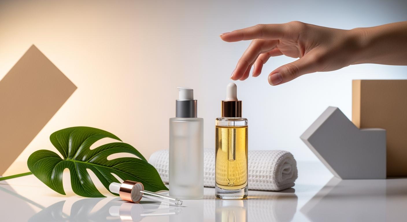
The visual difference between clear and frosted packaging changes once the bottle is filled and labelled. A brand may want customers to see the remaining product, hide a visual fill line or create a softer surface effect. These objectives should be explicit before comparing samples.
Separate the material from the finish
Identify the base glass or resin and the process used to create the selected appearance. A frosted effect can be described too loosely; ask whether the appearance comes from the component surface, a coating or another defined construction.
The process matters when evaluating handling and future changes. Two samples can look similar while needing different decoration or exposure checks. Keep the finish reference linked to the actual component rather than approving a generic frosted look.
Compare filled visibility
Use the intended formula and representative fill. View the level and colour through the complete decorated bottle under agreed lighting. Check both the main display face and any area intended as a product-level window.
For a frosted sample, determine whether the fill level is still readable where required. For a clear sample, inspect the visible shoulder, dip tube or internal insert. Decide which visible features are acceptable instead of discovering them after a retail photograph is prepared.
Approve artwork against the filled background
A clear bottle’s artwork background includes the formula and whatever is behind the bottle. Test text contrast with the actual fill, not just against a white screen. Required information should remain legible in the intended layout.
On a frosted surface, review print edges, contrast and label appearance on the chosen construction. Confirm the usable decoration zone and any effect of shoulder transitions. Keep the approved physical proof with the artwork revision.
Keep light protection as a separate requirement
If the formula needs protection from light, ask the responsible formula and packaging teams to define the evidence required for the actual pack. Clear, tinted, opaque and frosted appearance names are not interchangeable protection specifications.
Do not claim that a visually softer surface preserves active ingredients without the relevant assessment. Likewise, clear visibility is not proof of product freshness. Public wording should describe the observed appearance rather than making an unsupported formula claim.
Review surface consistency and handling
Compare representative pieces for changes in the frosted effect, clarity, coating boundaries and visible marks. Agree viewing conditions and acceptance examples. A single attractive sample does not define the acceptable range for production.
Assess the intended handling and exterior wiping on the actual decorated sample. If a surface is coated, record any change around edges or contact points. Check protective packing so bottles do not arrive with rub marks that the dry appearance approval never addressed.
Release the visibility decision
| Requirement | Approval evidence |
|---|---|
| Finish identity | Component and construction reference |
| Product visibility | Filled and decorated physical sample |
| Artwork contrast | Actual-size proof with the intended background |
| Surface range | Representative appearance examples |
| Protection | Separate formula-specific evidence where needed |
Record these decisions in the sample approval checklist. The dropper bottle range provides assemblies to compare, not proof of a chosen finish’s performance.
Choose what customers need to see
Write the visibility objective before selecting samples. The brand may want the formula colour to be visible, the remaining level to be readable or the dispensing parts to be less prominent. These objectives can conflict. Decide which view matters during normal use and which is mainly a presentation preference.
| Objective | Compare on the filled pack | Decision to record |
|---|---|---|
| Show formula colour | Actual formula through the finished surface | Acceptable colour appearance |
| Read remaining level | Representative full and partly used samples | Viewing area and readable conditions |
| Reduce internal visibility | Tube, insert and shoulder appearance | Which visible features are acceptable |
| Keep artwork readable | Final print over the changing background | Approved contrast and layout |
Use samples at more than one relevant fill level. A bottle that looks balanced when full may reveal a tube or change the background behind lettering as product is used. Keep the sample identities and viewing conditions attached to the decision rather than relying on a single launch photograph.
Review visibility and decoration together
For example, a frosted sample may satisfy the desired soft appearance but make a small product-level window difficult to read. That is a design trade-off, not proof that all frosted bottles are unsuitable. Review the window location, finish boundary and artwork on a revised physical sample.
A clear alternative may solve the level-reading issue while making the tube more visible. Compare both complete assemblies with the intended closure and fill. Record the preferred compromise so purchasing does not substitute a different finish because it seems visually similar when empty.
Define the acceptable surface range
Request representative appearance samples, not only the most attractive piece. Mark the areas where variation is especially noticeable, such as the shoulder, a finish boundary or the main display face. If the brand accepts a range, retain labelled examples that show that range under the agreed viewing method.
Separate appearance approval from formula protection and handling approval. A revised frosted effect may meet the visual target yet still need its own wiping and decoration review. Keep the component, finish and artwork revisions together, and state which checks were repeated when any of them changed. This prevents an earlier approval from being stretched to cover an untested construction.
Frequently Asked Questions
Is frosted glass always more premium?
No. Appearance is a brand decision; consistency, readability and use performance still need approval.
Can one finish reference cover glass and plastic?
Use it as a visual target, but approve the actual construction and sample for each material separately.
Share your requirements through the packaging enquiry page.