


Quick Answer
Minimalist packaging needs a measurable visual specification: artwork zones, text hierarchy, alignment, finish references and acceptable defect examples. Review the printed physical pack at actual size. Reducing decorative elements must not remove essential product information or replace functional packaging tests.
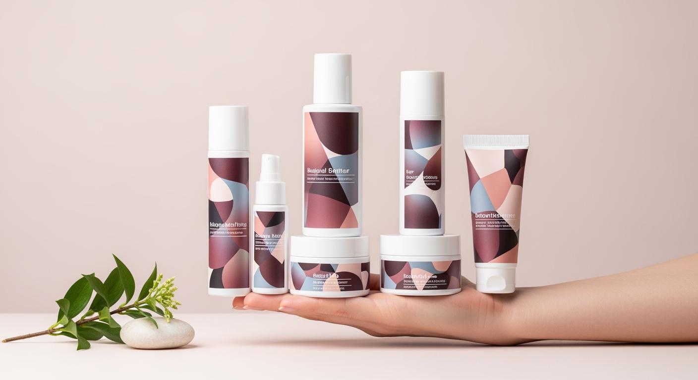
A restrained design exposes small differences. An off-centre logo or a mark on a plain surface can be more noticeable than on a busy graphic. The solution is not an undefined demand for perfect packaging, but a specification that the designer, supplier and inspector can apply consistently.
Mark the real artwork zone
Obtain the usable print or label area from the selected pack drawing. Mark shoulders, seams, edges and transitions that should not carry critical text. Translate the design into the actual dimensions instead of scaling a mockup until it looks attractive.
Define the front orientation and logo position from a repeatable physical reference. Specify what should align: logo to body, logo to panel or logo to cap. If the closure rotates independently, the supplier should not be held to an impossible alignment requirement.
Test information hierarchy at actual size
Print or decorate a physical proof. Read the product name, variant and capacity as they will appear on the smallest pack in the range. A large screen view can hide thin strokes, low contrast or cramped lines.
The brand’s responsible reviewer should confirm required information for the product and destination. Minimalism is not a reason to omit it. If space is limited, revise the layout or label construction through an approved process rather than simply shrinking all text.
Define the plain-surface standard
Choose a physical finish reference and inspect under agreed viewing conditions. Classify marks by location and visibility. A mark on the main display face may have a different consequence from one on a concealed base, but the distinction must be explicit.
Retain examples of scratches, print defects, contamination, seam appearance and finish variation that are accepted or rejected. Do not rely on a general phrase such as premium quality. An inspector needs observable criteria and an escalation route for borderline samples.
Keep appearance and function in separate records
An excellent plain white bottle can still have the wrong neck fit, dispenser output or formula compatibility. Approve the decorated appearance and the functional assembly separately, then confirm that decoration has not disturbed the approved function.
For an airless bottle, retain the component reference and formula test status alongside the artwork approval. Avoid treating a clinical-looking design as evidence of hygiene, effectiveness or formula stability.
Inspect a representative decorated set
Ask for more than one decorated piece and, where applicable, samples covering different capacities or material surfaces. Compare the intended relationship between them rather than requiring a paper colour proof to behave exactly like every plastic or glass surface.
Record which differences are accepted. Once the reference set is signed, changes to resin colour, finish, artwork or decoration process should be reviewed against it. Production inspection can then compare against the same physical target.
What the purchasing specification should contain
- Controlled drawing with artwork boundaries.
- Artwork file and revision identifier.
- Physical proof at actual size.
- Defined alignment reference and viewing conditions.
- Accepted and rejected defect examples.
- Separate functional and formula approval records.
Attach these items to the packaging sample approval before releasing an order.
Create an appearance review sheet with observable criteria
Start with the main display face, then list secondary faces, shoulders, base and closure separately. For each zone, specify the intended artwork, finish reference and observation method. Record lighting, viewing distance and whether the reviewer examines a filled or empty pack. These conditions should be agreed for the project; do not invent a universal distance or scratch allowance and treat it as an industry standard.
| Review item | Evidence to retain | Question to resolve |
|---|---|---|
| Logo position | Drawing reference and decorated sample | Which physical datum defines alignment? |
| Small text | Actual-size artwork and printed proof | Can the intended reader distinguish the variant? |
| Plain surface | Accepted and rejected physical examples | Which visible zones have different limits? |
| Colour relationship | Signed family reference set | What variation is accepted across materials? |
Compare colour and finish without a screen-only approval
A white tube, frosted glass bottle and coloured pump can belong to one range without appearing identical. Place the actual samples together and identify the relationship the designer intends. If a surface difference is deliberate, document it. If it is unacceptable, identify which component must change rather than asking all suppliers to match a screenshot. The colour master-sample and batch-control guide explains the separate approval record for this work.
Check the pack with the intended formula or an agreed development sample when fill visibility affects the design. A clear area can change the perceived background behind text. Inspect the artwork after realistic handling relevant to the project, using an agreed protocol. Do not describe a finish as durable merely because the first sample looks clean.
Resolve a borderline defect before the order is released
For example, a small scuff might be accepted on a concealed base but rejected across the front logo. Label those examples and record the location; an unlabelled photograph of a mark leaves the inspector to guess the decision. Escalate uncertain samples to a named reviewer. If the acceptance rule changes, update the reference set and inform production and incoming inspection together.
Review whether the design can be adjusted to reduce ambiguity without removing essential information. Moving text away from a shoulder, increasing contrast or choosing a different label zone may be more useful than repeatedly asking for a cleaner print. These are project options requiring a new proof, not guaranteed remedies. Keep the design decision, appearance approval and functional approval linked but distinct.
Frequently Asked Questions
Is a minimalist pack cheaper to produce?
Not necessarily. Surface finish, inspection requirements and decoration process affect cost even when the artwork is simple.
Does a small logo need a different proof?
It needs an actual-size proof on the intended surface to confirm legibility, position and printing quality.
Send the component brief and required checks through the packaging enquiry page.